Fujitsu B22W-5 ECO Service Manual Page 29
- Page / 36
- Table of contents
- TROUBLESHOOTING
- BOOKMARKS
Rated. / 5. Based on customer reviews


Notes on ergonomic c olo ur ad just men
t
Notes on ergonomic colour adju
stment
If you select colours for the monitor in your a pplication programmes,
take note of the information below.
The primary colours blue and red on a dark background do not produce the minimum
required contrast of 3:1 and are therefore not suitable for continuous text and data e ntry.
When using several colours for characters and background and giving the primary colours full
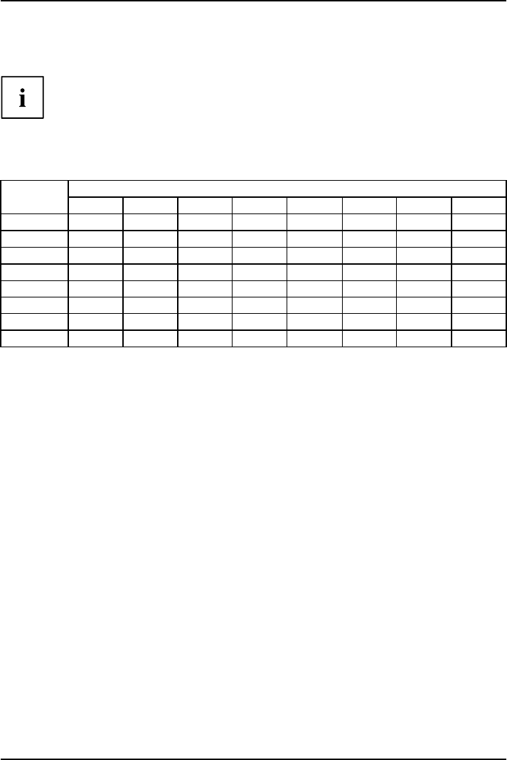
modulation, you can obta in very suitable colour combinations (see the following table):
Characters
Background
black white purple blue
cyan green
yellow red
black
++
-
+++
-
white
+++
---
+
purple
++
-----
blue
-
+
-
+
-
+
-
cyan
+
--
+
---
green
+
--
+
---
yellow
+
-
++
--
+
red
-
+
----
+
+ Colour combination very suita ble
- Colour combination not suitable because colour h ues are too close together, thin characters
are not identifiable or rigorous focusing is demanded of the human eye.
A26361-K1320-Z220-1-7619, edition 2 21
- B22W-5 ECO 1
- Do you have 2
- ESPRIMOVIEW 4
- FUJITSU B22W-5 ECO 5
- Contents 7
- Your LCD screen 9
- Further information 10
- Notational conventions 10
- Important notes 11
- Power cable 12
- Transporting the device 12
- Cleaning the device 12
- CE marking 13
- Energy Star 13
- Disposal and recycling 14
- Getting started 15
- Adjusting the height 17
- Adjusting the inclination 17
- Adjusting the rotation 17
- Connecting the device 18
- Operation 21
- Notes on power management 22
- Changing the monitor settings 23
- Locking the OSD menu 24
- Locking the ON/OFF button 24
- OSD menu functions 26
- Adjust ing the volume 27
- Adjusting the dis play of t 27
- Displaying information 28
- Troubleshooting 30
- EXIT / AUTO 31
- Notes regarding the 32
- DIN EN ISO 13406-2 standard 32
- Technical specification 33
- Preset operating modes 34
- SUB D port 35
- DVI-D port 36
 (35 pages)


Comments to this Manuals